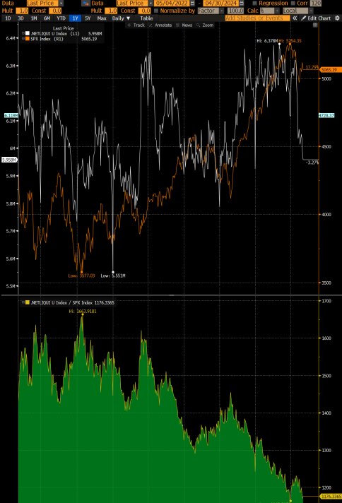
Chart of the Day – Net Fed Liquidity vx SPX – Look Out Below

Source: Bloomberg
One of my favorite charts that trigger folks is this one, which looks at the net liquidity of the Fed’s balance sheet with the performance of the SPX.
Net Liquidity is the Federal Reserve Assets less Treasury General Account less RRP. It’s a crude metric for available liquidity that can be invested into STONKS. It’s not a perfect indicator. I get it. It is a proxy for liquidity. It’s not the only one.
Well, since April 15th tax date, it has been falling mightily as the TGA has restocked and now the RRP is restocking again (after bottoming on tax date) because yields on the RRP at 5.3% are attractive inflows again. As a result, bank reserves continue to come under pressure.
So before everyone gets excited about how the drain of the TGA from $950bn to $750bn by the end of June is going to be bullish for risk assets, perhaps they should first trade the impact of the sizable liquidity withdrawal we have seen over the last two weeks.
Look out below!!