
My 3 Step Framework for Staying Long

The Hard Part
Throw a rock and you’ll hit someone who says “man, if I only held onto that stock.”
Everyone’s got the one that got away.
The position they talked themselves out of at exactly the wrong time.
And in the world of trend following, that’s a cardinal sin.
Let the winners run. We’ve all heard it.
But most people stop right there.
Because if we’re being real….they only know the cliché.
They haven’t put in the reps or developed a framework worth sharing.
It’s simply a bumper sticker without the execution.
So let’s get into it.
Here is a simple 3-Step Framework to Help You Stay In Your Trades.
Step 1 – Know Your Timeframe
This sounds obvious.
It isn’t.
“Know your time frame” is one of those things people say and then immediately ignore when the market gets choppy.
But it’s the most important psychological decision you make before you ever enter a trade.
Here’s why.
A short-term trader and a long-term investor can look at the same instrument and come to opposite conclusions.
And both can be right.
The problem is mixing time frames without knowing it.
A stock can be great on a long-term basis and still drop 20% in the short term.
If you don’t know which game you’re playing, that 20% will shake you out of a position that was right all along.
Without a defined time frame?
Every pullback looks like a reason to sell. Every single time.
So let’s start with the weekly chart. Zoom out.
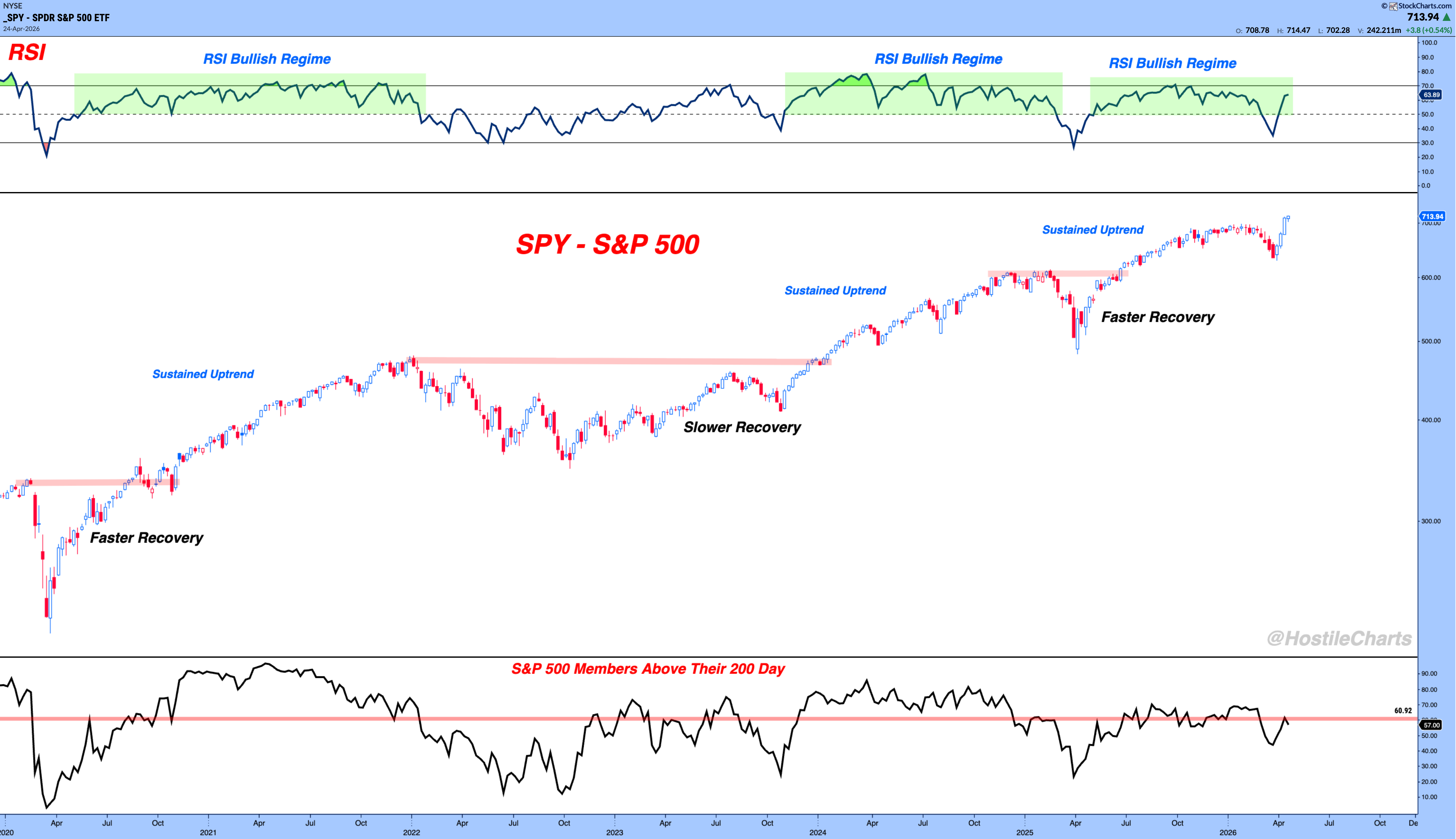
Weekly Candles
On a five-year weekly view, those individual red candles barely register.
The long drawdowns look significant in the moment, but from 30,000 feet, the trend is clear.
If this is your time frame, a 9% pullback probably shouldn’t move you out of your position.
Zoom into the daily and the picture changes.
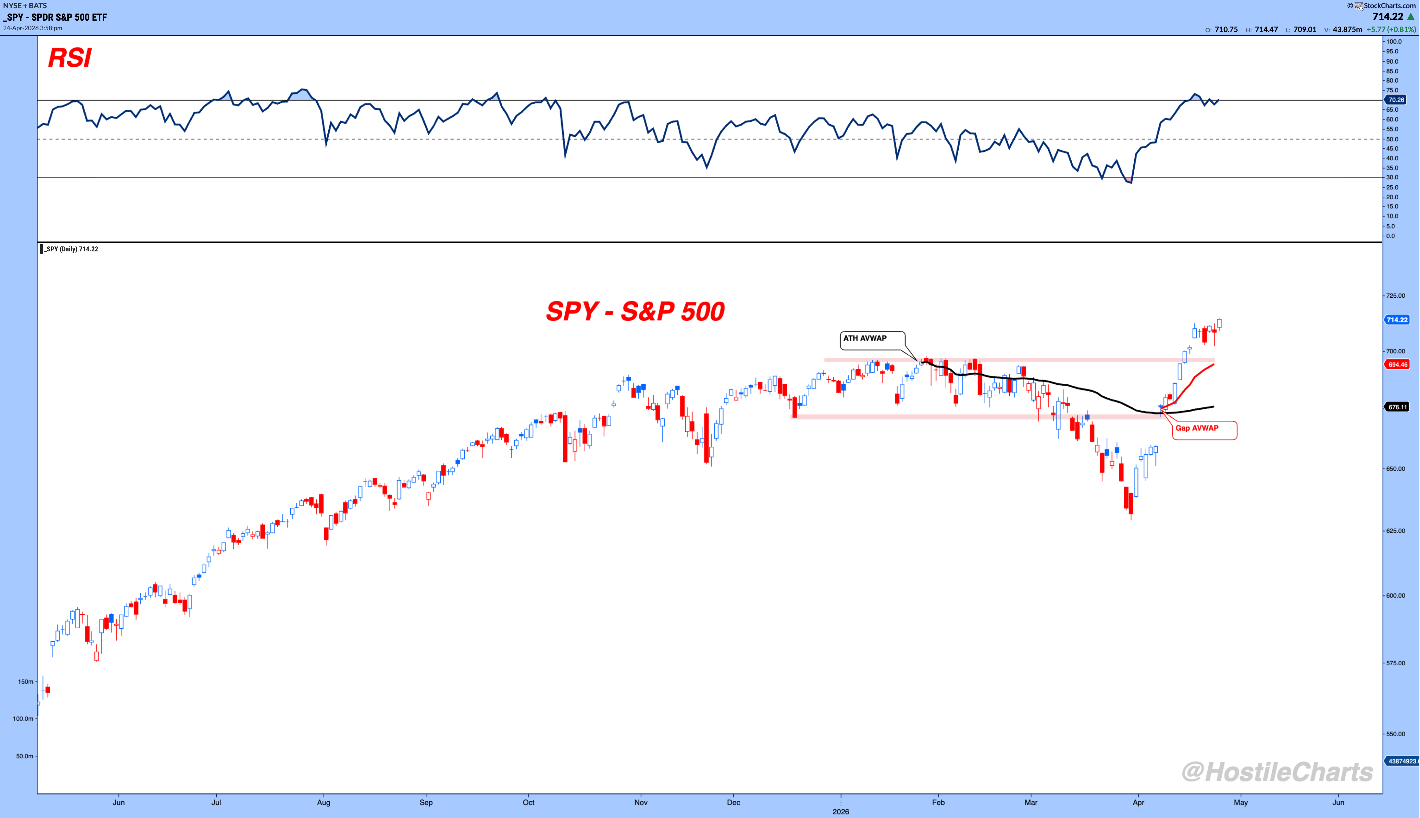
Daily Candles
You can see the uptrend channel, the recent pullback, and the V-shaped recovery.
For a intermediate-term trader, this chart might have you using a horizontal support level as your line in the sand.

65 Minute Candles (6 In A Day)
Drop down to the 65-minute chart and it’s a completely different world.
You could have been short during the selloff and repositioning long on the reversal.
But don’t be looking at the 65-minute chart every day if you have a year-long holding period.
That’s the trap.
Here’s a simple guideline….take it as you will, just a frame of reference:
-
Short-term (days–weeks): 65-minute & Daily Charts
-
Medium-term (weeks–months): Daily & Weekly Charts
-
Long-term (months–years): Weekly & Monthly Charts
Know which game you’re playing. Then align your chart to match.
Step 2 – Let the Trend Do the Work
This is the bread and butter of managing a position.
Think about it for a second.
Seriously. Take a second and think.
If you’re truly data-driven, you’re not the one making the exit decision.
The market is.
That’s the whole point of trailing stops.
You hand your decision-making over to price, and price tells you when to leave.
Most people struggle with this because they want to be predictive instead of reactive.
They want to call the top.
But ask yourself – did your research make the market gap up?
No. The market made the market gap up.
If the tweet mattered, price would change.
If the earnings mattered, price would change.
Trust the tape.
Once again…many say it. Few actually do it.
There are hundreds of trailing stop methods out there. Here are 3.
Example 1 — Exponential Moving Average (EMA)

EMA
The 30-period EMA on a 65-minute chart is essentially a five-day moving average.
If we’re above the five-day, stay around and play.
Every day since this rally started, SPY has closed above it.
The EMA trails price upward as the market climbs, so your stop rises with it.
When price closes decisively below it, you’re out – no decision required.
EMA vs. SMA: the EMA weighs recent prices more heavily, so it’s more reactive.
Neither is better – one is just quicker.
Example 2 — Anchored VWAP
Anchored VWAP takes the concept a step further by adding a volume dimension.
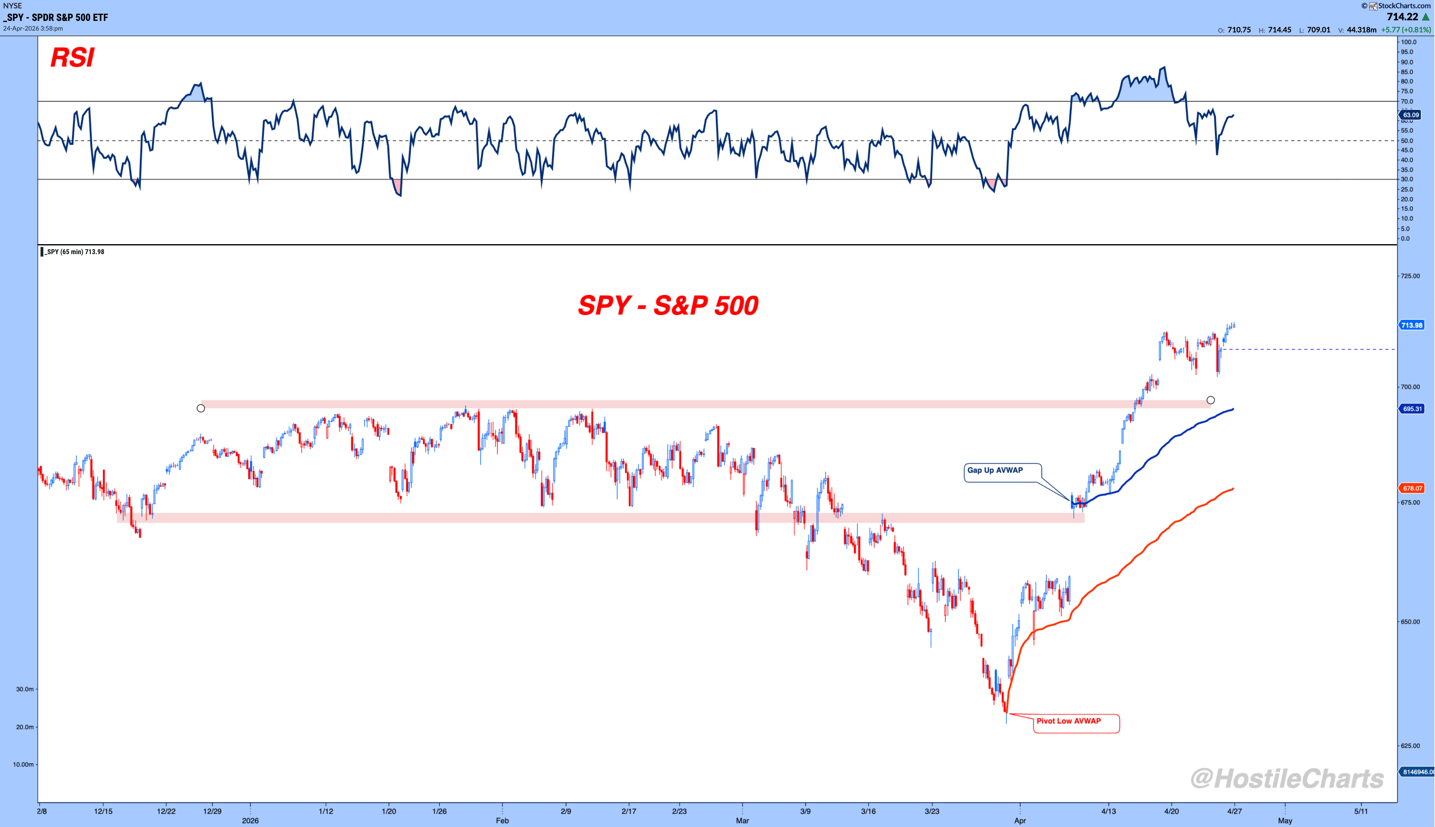
AVWAP
You anchor it to a pivotal point.
A pivot low, a gap up, a key date and it trails from there.
The Pivot Low AVWAP anchored to the bottom of the selloff and the Gap Up AVWAP anchored to the recovery both serve as dynamic support.
As long as price holds above them, the trend is intact.
Example 3 — Price Channel (30-Period Low)
This uses the rolling lowest price over the past 30 periods — roughly a five-day low.

Price Channel (Lows)
Your stop is simple.
If price breaks below that level, you exit.
In a strong uptrend this rarely happens – the channel climbs gradually as new lows run off the look-back window.
Like I said.
There are plenty of other tools out there.
The specific method matters less than the discipline of using one.
Pick what fits your style.
Pick what you actually understand.
And stick with it.
There’s no holy grail.
Step 3 – Weigh The Evidence
Trailing stops tell you when to exit.
The weight of evidence tells you how aggressive to be while you’re in.
Should you be adding to positions? Sitting tight? Just letting your stops ride?
There are plenty of ways to do this — here’s a simple framework to start with.

Trend — Price vs. the 30-Week Moving Average
Is price above the 30-week MA?
That’s the long-term regime filter.
That’s the game we want to be playing.
Breadth — % of S&P 500 Above the 200-Day MA
60% or more above their 200-day MA means broad participation.
When you go fishing for stocks, the odds are in your favor.
Below 50%? You’re swinging at pitches that are likely already in downtrends.
Momentum — Cyclicals vs. Defensives
Are offensive sectors leading?
Tech, discretionary, and industrials leading means institutions are betting on growth.
When utilities, staples, and healthcare take over – that’s a defensive rotation and a warning sign.
This is one reason I was cautious early in 2026. Leadership was defensive.
Sentiment — VIX Level
Below 20 is a low-fear environment.
One spike above 25 doesn’t change the regime.
A sustained stay above 25 might.
Credit Spreads — HYG vs. LQD
The spread between high-yield and investment-grade bonds tells you whether the bond market sees elevated risk.
Tight spreads = green light.
Widening spreads = the smart money is getting nervous before equities figure it out.
The Scoring Rule
3 or more greens → Keep trading your process, consider adding on pullbacks
Fewer than 3 → Tighten stops, don’t add new capital
All red → Go defensive, wait for the evidence to shift
Just a simple framework — there are plenty of ways to skin the cat
The Bottom Line
Bull markets don’t die because of bad news.
They die when the weight of evidence shifts.
Until that happens?
The default position is long.
But staying long is the hard part and now you have a framework for it.
Know the time frame of the game you’re playing.
Let price tell you when to exit.
Weigh the evidence weekly.
Do those three things and you’ll stop leaving winners on the table.
Anyway, that’s my two cents.
My Weekly Live Show
Check it out.
🚀 Throw it on 1.5x speed and let it rip.
👍 Give it a like. It’s the easiest way to show me some love.
FREE – The Sunday Stalk List | Ep. 42
Tomorrow, I’ll break down more of what I’m buying in the Sunday Stalk List.
If you want clean charts, clear setups, and tactical insights, this one’s for you.
It hits your inbox every Sunday so you know exactly what to stalk for the week ahead.
Cheers,
Larry Thompson, CMT CPA


